Always be updated with the upcoming things, thus to make you updated we brought the Upcoming E-commerce Web Design Trends to Adopt in 2019. As we all know that nowadays business is running online on the E-commerce website.
However, there are big players in the online shopping site. Such as Amazon, Flipkart, and much more which are leading the impact by presenting new innovations. Thus, to get top rank in the competition of the e-commerce business. The businesses need to be aware of what is new on the market. And how they can impeccably make the impression on the users.
Consequently, to stay in the industry E-commerce website design company needs to be updated with the current trends. For a long time, e-commerce was organized at home from computers and laptops. But now they are well conducted by cell phones and tablets.
Thus, this is what we are elaborating here! Keep reading…
E-commerce Web Design Trends to Adopt
With the advancement of technology, most individuals have just forgotten the time when they used to buy things manually. Thus, to be updated with the latest technology we need to follow out the upcoming E-commerce web design trends which you should adopt in 2018.
1: Mobile Friendly Design

According to the latest research e-commerce is another name of mobile shopping. The shopping via mobile has broken all the records of shopping as compared to the previous way of shopping.
However, day by day mobile shopping has risen up to the sales of all the e-commerce business to a large extent. As per the research, shopping through the mobile is pushing up. Thus, customers like to search the things by the use of mobile in spite of the laptops or mobiles.
Somehow, they like to explore different kinds of things in e-commerce stores. Thus, all the E-commerce web Designer need to accept this upcoming trend.
2: Hamburger Menus
![]()
For many years the hamburger menus are in trend and they will continue in the future too. Might be you have seen many sites which are using the hamburger menus.
For this, the framework which is used by the designers widely is the bootstrap. And nowadays many of the sites are developed by the use of the bootstrap framework. However, this pattern is followed by designers all over the world.
But in 2018, you will see some of the change in the hamburger menu. i.e, you will now check the menus on the left. As most of, the sites and even search engine have started placing their menus on the left such as Google.
3: Motion Animation
Motion Animation will become the most updated and cool trend in the e-commerce development industry. However, this will become an excellent and nonstandard method.
Often, It is the utilization of the animation that provides the user with a good experience. By using the e-commerce website trend. Well, for those businesses which are highly serious about their sales perspective.
They need to offer the user with a great shopping experience. And they can do so very easily by adopting such trends.
4: Efficient Loading and Layout

Data usage is still a real concern for many mobile users. However, the packages being given by several service providers are becoming generous. The savvy website designer should still look to maximize efficiency by simply loading which is necessary.
In the context of e-commerce sites, this applies to most of the product listings.
Well, despite listing to hundreds of the products on a single page, it is much more efficient to load the first ten. And then only loads subsequent sets of ten. Somehow, if the user scrolls below the current list.
E-commerce Website Design sites, who handle the loading bar efficiently. Are more likely to appeal to mobile customers than those who are data hungry all over time.
5: Templates
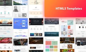
Templates which are meant as a sign of laziness. However, this is not necessary in all cases. Often, there is a good reason that the vast majority of smartphones. Features the essentially same design and layout.
Consequently, a few individual tweaks depending on the manufacturer. This is because those designs work well. As with all things Android, there is plenty of room for customization so using the Material Design motif doesn’t necessarily mean your app will appear identical to others.
Several numbers of websites are using the same design principles. Onto which the Material Design is based on. Thus, you should check out the motif for inspiration on designing your own site.
6: CSS Grid Layout

CSS Grid Layout is a two-dimensional layout model. As well as part of the CSS standard from the world wide web consortium. However, it provides the designers with significantly more control over how a web page is laid. And help to make much better use of space across devices and screen sizes.
In other words, CSS Grid Layout makes optimizing user interfaces relatively easier as compared to other methods.
As websites make up simple documents into complex, interactive applications, techniques for document layout, e.g. floats. Which were not necessarily well suited for application layout.
7: Forms: Full-Screen Search

For many years, models have been an effective user interface. And they are common for many e-commerce websites. Thus, here we arrive at a question. What may be the action which will be taken for 2019?
It means it is the use of full-screen models for search and forms. The trend is coming from a mobile-first web design. However, on a mobile device, many models take the most or available space on the screen.
For example, Overstock means using full screen modal for its newsletter registration form. Which pops up for new site visitors. Often, the available form is centered, full screen and even open on a much larger screen. That translucent gray stretches from end to end.
8: Much More Video
As we all know that video is a very important medium to convey complex information, telling stories, and evoking emotion. However, a number of videos scattered on the web and watched by internet users rise every day.
Thus, it should not be a shock that online retailers are also using more video elements in E-commerce web design. Many websites, which has been using videos and content marketing for several years, lead the way by adding video inline on product details pages.
9: Micro-interactions
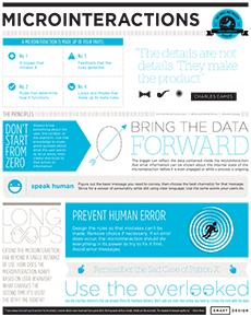
Microinteractions came into the existence since Facebook added the “Like” button to its posts. Thus, this started as a way to rate social media contributions. Which has grown into one of the more famous website and application trends for 2018?
Well, for the online sellers, a micro interaction is the best trick. Which can be its power to help and create habits. Or at the very least reward the users for completing particular tasks. Such as addition of a product to the shopping cart, reviewing a product, or subscribing to an email newsletter.
As the chief editor of planet UX points out that, “Microinteractions have the ability to encourage users to actually interact.
They are strong instruments that help to make habit loops. Some of them are as follows:
- A trigger that starts the microinteraction.
- Rules that determine what is going on in the interaction.
- Feedback communicates what is going on and what just happened.
10: Guided Selling
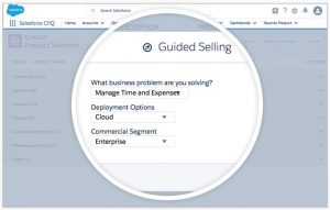
The main motive of guided selling is to ask shoppers a question, about features and the usage to help them discover the specific item.
However, it has moved for several years under e-commerce. Thus, the north face site will help you find jackets. And many other sites have a three-step supplement finder. To help you in making your site fitness well.
Conclusion
Here, in this blog, we have discussed the 10 Best Upcoming E-commerce Web Design Trends to Adopt in 2018.
Often we concluded its layout, its definition, and the upcoming trends in detail. They do add value to any blog post. And, this leads to the end of the blog.
We hope this blog helped you. However, if you found the blog useful, do not forget to use the comment section provided below. Also, share the blog with your peers. You are on your way to getting more exposure.






Leave a Comment