Looking to know about the web design impacts on customer’s online experience. In the modern world, web design has a huge impact on customer online experience.
Often said, It has a great impact on customer’s online experience in several ways. However, it is one of the most important parts of any Internet marketing strategy. Well, your website’s aesthetics, utility, many other important factors are essential for your company’s long-term online success.
Thus, this is what we are elaborating here! Keep reading…
How web design impacts on customer’s online experience
It has been a great question for a long time. Thus, when it arrives to develop a great user experience, design, and layout on your website. Then it can be a very effective tool for you. Thus, to use the same tools in your marketing strategy.
Now, your website is very likely to have the first point of contact with any potential customer. And as you all know the value of first impressions count. Despite having the wrong experience it is extremely important that you get your first user experience (UX) right.
This blog drops a light at how web design impacts on customer’s online experience.
Major Aspects of Web Design on Customer’s Experience
The first time a user experiencing your website should meet its need as soon as possible. The information they are looking for and things to be presented to them in such a way that they look good and are easy to read.
Following are the major aspects due to which the customer’s online experience gets affected.
1: Appearance
The web design most clearly impacts the appearance of your website. Even you select what your site looks like. Thus, it plays a big role in your company’s first impression on new online visitors.
As we all know that the first impression is considered as the final impression. And that impression is calculated by the appearance of your website. Often, the design always catches the user to look at the best web designing services. And take experiences of the product in online marketing.
Often, you will hear about web design in two extremes of marketing experts (including us):
- Older websites that look like they were made in 1996.
- Newer, sleeker websites that adhere to modern web design standards.
Thereout, modern web design trends include:
Responsive Design: It means using the code on your site. That makes it look and function the same, regardless of the device used to access it.
That’s because somebody comes to your site from a smartphone or desktop computer. They will definitely get a great great experience and find the information they want.
- Parallax Scrolling: Somehow it means that overlaying two visual elements on a page. And moving them at different speeds as another scroll.
- Big/Bold Fonts: They are in circulation for a few years now. Essentially, the concept is referred to using the sans-serif typeface. Which are very easy to read from the window screen.
- Multimedia: It refers to images, videos, interactive, and other visual elements that help break up text and educate your visitors.
2: Clarity
Clarity of any website means the outlook of a website so many visitors can come easily to navigate your website and search the data they need. Somehow, it means designing your website so visitors can find what they want as quickly as possible.
It completely stands for improving your navigation. However, today, navigation comes in a few well-known styles which are as follows:
- Breadcrumb: This navigation is inspired by the story of Hansel & Gretel. Thus, whenever someone clicks on a new page. Your website automatically adds their previous page to a navigation bar. So, a user can click back to that page in an instant if they want.
- Drop-Down Menu: It lets someone hover their cursor over a menu title. And see the pages that category contains in them. However, they may click on the page. That interests them to get the information they want.
3: Professionalism
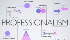
Professionalism refers to the impact you make on your website visitors. Before they start reading your site information or content.
However, when someone comes to your website. You want them to understand that you are a modern, respectful business. The only impression is largely based on how your web design represents you.
Here, are the several web design elements contribute to professionalism as follows;
- Culture Page: It is a part of your website. That’s exclusively dedicated to talking about your company’s approach to daily operations.
- Photos of Staff: Here, you undergo a long way in reinforcing professionalism. Whether you choose to show them together in a happy hour or hard at work is only up to you.
Else, you are adding faces to your business. That represents visitors that you are more than a brand name — you’re a thriving company.
4: Load time & Website Efficiency
It refers to how long someone has to wait for a page on your website to display on their device screen. However, load time is a key Google ranking factor. And it becomes important for online success. As more consumers move towards using the internet on the mobile device.
Here, are the key points to reduce your website loading time?
- Optimize Image Sizes: You must optimize the image size on your site. To make sure your website loads as quickly as possible. However, to do that use the .jpg images on your site.
Consequently, compress the images before using them on your site.
- Remove Autoplay Multimedia: You should remove such multimedia. Like audio files, videos files from your site.
This means that when your users visit your site on their smartphone. Then he/she will not have to use a large portion of their mobile data.
- White Space: You may use this to reduce the data demand frequently. However, white space is the unused space on your site page. Like the page containing No text, no images, no videos — nothing.
The white space spreads your text and elements. Only to make them easier to see, especially for mobile users. Avoiding this, we should reduce the white space.
CONCLUSION
Here, in this blog, we have discussed the Web Design Impacts on Customer’s Online Experience (2018).
Often we concluded its layout, its definition, and the major aspects of the same in detail. They do add value to any blog post. And, this leads to the end of the blog.
We hope this blog helped you. However, if you found the blog useful, do not forget to use the comment section provided below. Also, share the blog with your peers. You are on your way to getting more exposure.







Leave a Comment