Here we are going to discuss the 15 most effective WordPress website design tips. As we all know that WordPress is the most popular platform for people to creating websites. And the reason behind being popular is its affordability as well as ease of use.
It stands out as a tremendous solution. Which is perfect for creating websites designs and blogs. But to make a website successful, many things need to come together. Besides the content of the site. The design of the website has to look attractive in order to turn visitors into loyal fans.
However, there is a pretty good possibility that you will use the CMS (Content Management System) sooner or later as 26.4% of the web uses it. Well, if you are creating a site with WordPress, then you have to take and follow the right tips. Well, some of the effective foot tips to follow are as follows:
- Avoid neglecting your site.
- Increase speed & avoid unnecessary plugins.
- Improving the WordPress Editor.
- Show your author info at the bottom of each post.
- Tag photos.
Thus, this is what we are elaborating here! Keep reading…
WordPress website design tips
A well-designed website wants to be out of any brand. When it comes to select a platform, then the mind stuff to the most popular CMS i.e, WordPress. For the companies of all sizes.
However, If you are very excited to create a fresh web for your business. Then follow out the Most Effective WordPress Web Design Tips which are as follows:
1: Selecting the Best Theme for Balance Design and Functions
The sites built by using WordPress comes with a set of design themes to pick from. Thereout, selecting a strong theme that allows flexible visual design and future expandability is very important.
But it can be easy to get overwhelmed if you don’t have a starting point to work from. Well, one of the foundations available for WordPress themes. Which explains how clients and developers alike can benefit from using it.
Often, for the brands and companies, Genesis has numerous other strengths. Some of them are as follows:
- Built-in search engine optimization (SEO) to help drive organic traffic.
- Enhanced security to help protect your site from getting hacked.
- Easy extensibility to incorporate plugins and added features.
- The ability to run and update multiple sites from the same interface.
2: Use Plugins to Enhance Your Brand and Engage with Customers
Once you place a foundation for your brand’s website. Thereout, plugins can add significant functionality to both the back-end user interface of your WordPress site.
However, It is possible to increase the performance of your site to load it and operate faster. For companies eager to connect with customers on a deeper level, plugins offer a lot of variety to achieving this goal through your website.
Often, using the “Ninja forms WordPress plugin” give your marketing channels a boost. That enhances marketing power via customized forms. For that, you just need to install this plugin on your WordPress website. Somehow, if you are3 not very aware of doing so. Then feel free to move along with our blog on how to install a WordPress Plugin.
Consequently, the piece delivers integration tips. That can help in improving customer engagement, gather useful data, encourage signups, and make it easier to build ongoing relationships with customers who visit your Website.
3: Avoid Overloading Your Site with too Many Plugins
Plugins can be perfect for extending your WordPress site’s functionality. But it’s also possible to go overboard with these simple tools.
Thus, stacking your site with too many plugins can cause unwanted problems. Especially when if you are using old or outdated plugins. In a perfect world, every WordPress developer would have access to their own crack team of battle-tested designers and front-end wizards.
However, if you are working with WordPress. Most of the clients will see you as a one-man army. You will frequently be expected to make design choices, which you might not be able to track comfortably. Because design is a crucial aspect of every web development project.
4: Keep up With Current & Dynamic Web Design Trends
This is not kind of vogue, we are not going to devote thousands of words to analyzing in-and-out current design trends. You are probably familiar with what’s purely by virtue of general web browsing is.
However, It’s well worth. That you will take the additional effort to deliberately investigate the major trends. In order to stay current and updated.
5: Parallax Scrolling
By using the simple but effective motion design technique. Where foreground images can move faster than that of background. This creates an eye-catching effect. Which is easy to implement and lends to visual interest towards the design of a page.
Here, you will see this effect employed quite. Often, to make headlines really pop and draw the readers in. Then Parallax Scrolling is just a kind of single trend highlighter. The overarching of scroll-heavy focuses much on current trend designs.
6: Material Design
Now Google’ attempt to build a cohesive visual language.
Across their products and services. Material Design is focused on providing seamless design experiences regardless of platform. And they do so in a better manner. Along with a mobile-first mindset.
7: Card-Based Design
The best example of this is Pinterest. It is a technique with an emphasis on the elegant visual display of condensed information. These trends are so popular. And build a visual engagement by following a simple set of good design rules.
We will touch many of these rules. As we go through the rest of our list. However, due to familiar with current trends. Like the one which we have highlighted.
Very often, it is a great way of turbo-charging your learning. And almost instantly improving your overall design sensibility.
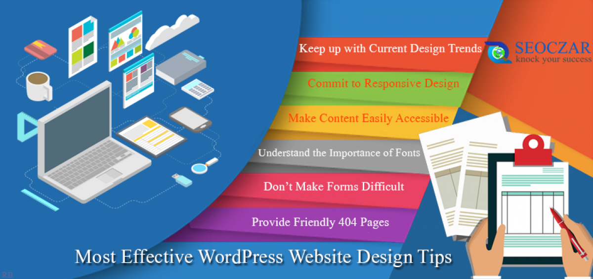
8: Commit to Responsive Design
Responsive design simply has the ability to involves the appropriately adjust to every user’s screen size, device orientation, and platform.
However, It’s an absolute requirement for modern sites on the front end. But can often feel like a duct-taped nightmare of media queries. And assorted hacks under the covers in a mobile-first world.
9: Make the content easily accessible
Under this tip, we need to focus on the Bounce rate of the very working site. “Bounce rates vary wildly” from the designer point of view. However, if you want the users to be able to quickly determine which a part of your website holds the information.
Keep the navigation very friendly and label everything clearly to avoid the confusion.
10: Remember that White Space is Your Friend
By the nature of their work, developers are an organized bunch. As they are optimizing for efficiency rather than aesthetics. This is why they often tend to treat websites like old times newspapers-filled to the brim with information.
However, the effective use of white space. Which is one of the most elegant and time-tested ways of doing this? Well, it not only highlights the important information. But it also improves reading comprehension and makes your overall design look substantially sleeker.
11: Understand the Importance of Fonts
In design terms, fonts are a very big deal indeed. There’s a reason behind this i.e, designers don’t just slap everything up in comic sans or courier and call it a day. Unless you’re running a gallery-based portfolio.
In the old days, that was the bad time when you couldn’t only choose from a limited set of fonts. While doing web design, but those days are thankfully gone now.
However, a perfect font can not take attention away from the content itself, or look out of place in the overall design. Selecting fonts and font pairings is a design decision that rewards careful thoughts.
12: Don’t Make Difficult Forms
Avoid making difficult forms, because they are the main way users interact with your site. Like: Registrations, lost password recoveries, contact pages, submissions, and the list goes on.
However, by using some extra time and effort to make yours forms intuitively usable, friendly and stylishly presented. Which instantly raises the overall design profile of your pages.
13: Stock up on Images to tell your Story
It’s easier than ever to find great pictures/images just to complement your words. However, we have many free sources such as Creative Commons Images on Flickr. By which you can search for compfight.com.
Often, they should be used with attribution. Thus, you need to read the license carefully and give credit where it is payable.
In addition, while adding the images to your WordPress website, be sure to fine-tune them for the web by saving them at the size you plan to use them. Often, this will help your site load quickly and it too draws your visitors in.
14: Accept that Small Details
We have covered the basic design trends, responsiveness, accessibility, using white space to your advantage, typography, and forms design.
But we are still only scratching the surface of all the elements you could consider in terms of raising your design game. There out you must accept these small details. And must rectify them.
15: Provide Friendly 404 Pages
Each and every website goes down eventually, even for a short period of time. However, it will be expected as a sign that your website shouldn’t be trusted by the daily customers.
So why not you take some extra time in order to build a unique error page to reassure them? Anything looks better than a default server error message on a white page. Often, a well-designed error page reassures visitors. And it provides the impression that everything is under control.
Conclusion
Here, in this blog, we have discussed the 15 Most Effective WordPress Website Design Tips.
Often we concluded its layout, its definition, and the effective tips in detail. They do add value to any blog post. And, this leads to the end of the blog.
We hope this blog helped you. However, if you found the blog useful, do not forget to use the comment section provided below. Also, share the blog with your peers. You are on your way to getting more exposure.


Leave a Comment